
Sports Analytics
Introduction/Overview
This page covers topics I have learned taking an Intro to Data Analytics course on Coursera. It will have the inclusion and utilization of downloading data, sorting/cleaning data, and creating different kinds of charts regarding sports. You can find my certification here.
Programs Used
Used basketballreference to collect and download data and then used Microsoft Excel to clean, sort, and show data
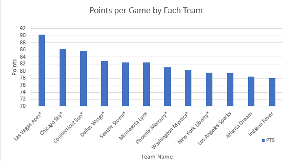
Bar Chart
This bar chart compares WNBA team’s points per game in 2022 WNBA season. In the 2022 WNBA season, the Las Vegas Aces had the most points per game
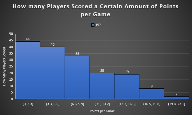
Histogram
Created a histogram to summarize WNBA players’ points per game in the 2022 WNBA season. Majority of the players scored between 0 and 3.3 points and while the more points, the less amount of players get those points. There are only two players that score between the range of 19.8 points and 23.1 points
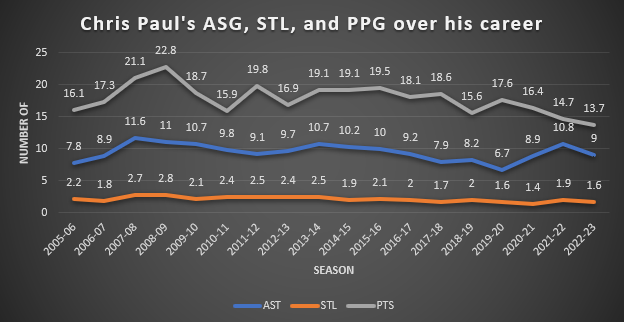
Line Chart
Created a line chart that demonstrated and compared NBA player Chris Paul’s points per game, assists per game, and steals per game throughout his career. Chris Paul steals per game ranged from 1.4-2.8. His highest assists per game which was 11.6 happened in the 2008-09 season. In this season he also averaged his second highest points per game with 21.1.
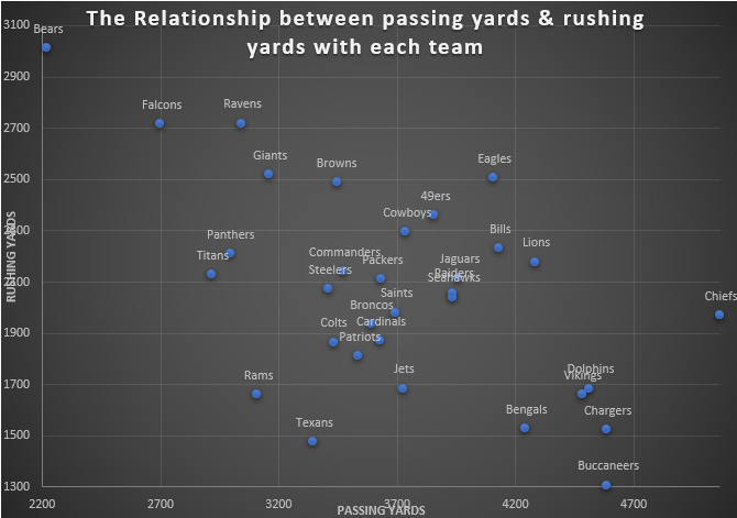
Scatter Plot
Created a scatter plot that demonstrated the relationship between yards gained by passing and yards gained by rushing.